Survey of Math Chapter 6: Exploring Data
Two Variables
Now we want to look at examples involving two variables (so far, everything has involved one variable). The two variables are measured on the same individual, and we hope that there is some relationship between the two variables.
These pairs are made up of a response variable that measures an outcome and explanatory variable that we think causes the changes in the response variables.
Example
Consider the stopping distance of a car travelling at different speeds.
The data was found at the following website: http://www.sci.usq.edu.au/staff/dunn/Datasets/glms/gamma/stopping.html.
In this case, the response variable is the stopping distance and the explanatory variable is the speed. We think that the stopping distance depends on the speed.
We need a way of representing the data graphically.
A pair of numbers (a,b) can be represented by a point in a coordinate system
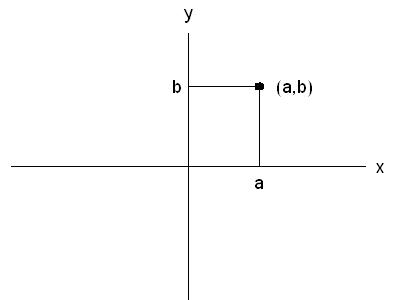
The pairs of number in this case are (speed, stopping distance) and so we get the scatterplot of the two variables as:
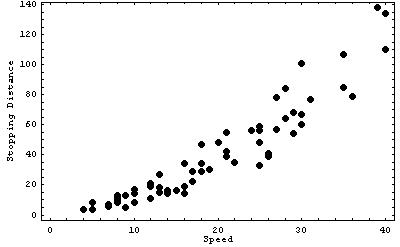
The points on the scatterplot represent the pairs of variables in the data table.
We can examine the scatterplot for overall pattern, form, direction, and strength of the relationship, as well as identifying any outliers.
The overall form of the scatterplot above is basically a straight line.
The direction of the plot is such that increasing speed increases stopping distance. The points are relatively close together, so the strength of the relationship is strong. There are no outliers in the scatterplot.
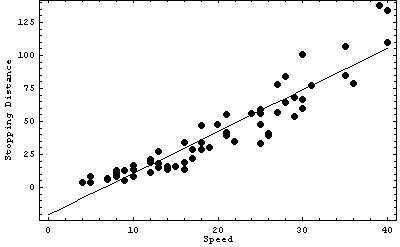
The line we drew on the scatterplot is called a regression line. It represents the behaviour of the response variable (stopping distance) as a function of the explanatory variable (speed).
We can determine an equation for the line, and then use that to predict stopping distance for speeds not in our table.
The equation of a straight line is given by y=mx+b, where x is the explanatory variable (along the horizontal axis, speed in this case) and y is the response variable (along the vertical axis, stopping distance in this case). The slope of the line is m, which represents how much y changes when x increases by one unit, and the intercept of the line is b, which is the value of y when x=0.
Here is a picture which represents these quantities:
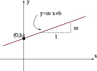
The triangle has base length of 1, and height of m.
Substituting in values for the explanatory variable (x) allows us to predict what the response variable (y) will be without measuring the variable.
For example, in this example the equation of the line is given by y = 3.15 x - 20.68. If the speed is x=5, we would expect numbers from the experiment close to y=3.15 (5) - 20.68 = -4.92.
This shows one of the problems with regression. The predicted value of the stopping distance for small speeds is negative, which doesn't make sense physically. We can see that our regression line is consistently underestimating stopping distances for small speeds (the regression line is below the data points). This tells us the regression line might not be accurate for small speeds. However, for larger velocities, the regression line has data points scattered above and below it. For large speeds the regression line probably represents the observations well.
You can use Excel to calculate regression lines for you for a given data set (there is an involved mathematical process to calculate the regression line), which we see in the next Excel lab.
There is one other number that can be calculated to represent how well the data would be represented by a straight line. This number is the correlation, usually denoted by r. The correlation measures the direction and strength of the linear relationship between two variables.
Data sets with correlation close to 1 are well represented by straight lines with positive slopes. Data sets with correlation close to -1 are well represented by straight lines with negative slopes. Data sets with correlation near 0 are not well represented by straight lines.
Further Examples
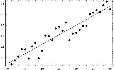
The data set has a linear shape, and is increasing. The points are relatively close together, so the strength of the relationship is strong. There are no outliers in the scatterplot.
The regression line (calculated using a computer) is y = 0.88 x + 7.48, and the correlation is 0.94.
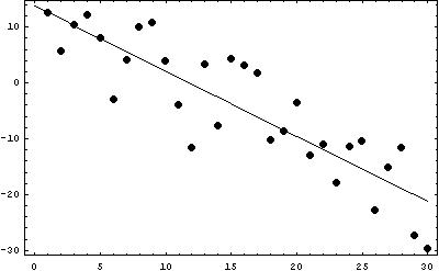
The data set has a linear shape, and is decreasing. The points are relatively close together, so the strength of the relationship is strong, but not as strong as in the example above. There are no outliers in the scatterplot.
The regression line (calculated using a computer) is y = -1.16 x + 13.76, and the correlation is -0.87.
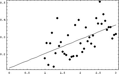
The data set has a linear shape, and is increasing. The points are not relatively close together, so the strength of the relationship is not strong. There are no outliers in the scatterplot.
The regression line (calculated using a computer) is y = 0.08 x + 0.12, and the correlation is 0.56.
Final Thoughts
It is difficult in some situations to see what the linear regression line should be, and so it is necessary to rely on computational methods to calculate the regression line if the scatterplot has points which are not obviously linear in relationship.
The distributions that we see in scatterplots do not always represent linear (straight line) relationships. Correlation measures linearity, so it will be of no use if the underlying relationship is not linear. Other types of regression exist that can fit data sets to more complicated functions than y = m x + b.