Comparison
Essay Example – Principles of Art
Images (for sample essay):
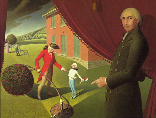
Grant Wood, Parson Weem’s Fable, 1939
Artemisia
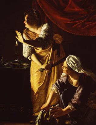
Gentileschi, Judith
and Her Maidservant, ca. 1625
Amon Carter
Museum, Dallas (Detroit
Institute of Arts)
Essay:
In comparing Wood’s Parson
Weems’s Fable and Gentileschi’s, Judith and Her Maidservant with the Head of Holofernes,
though the subject matter between both of them is very different, there some
striking similarities in composition- looking at these elements yields a better
understanding and appreciation of both works.
First, compositionally, both
paintings are asymmetrical. While
asymmetrical, both also seem balanced.
In Judith…, the gazes and gestures of the characters suggest that
there is something beyond the darkness on the left side of the composition-
they suggest that there is more going on than what we see, providing a sort of
implied balance. In Weem…,
although the composition is asymmetrical, Wood creates a central focal point so
deftly (as will be explained throughout) that the asymmetrical nature of the
composition is not distracting, therefore it seems balanced. Additionally, Artemisia’s composition has a
good example of tenebrism- it is overall, very dark, and Wood’s does not. Hierarchical scale helps Wood draw attention
to George, the most important figure (and focal point). He is much smaller – by scale – than any
other figure. Artemisia doesn’t use
hierarchical scale.
Regarding viewpoint, Wood places
viewers on the outside of a curtain that the Parson is drawing aside. It reminds me of a movie or theatrical
production (which, indeed, the whole scene is a fabrication of Weem’s
mind). This helps to portray the subject
matter as just a fable. In Artemisia’s
painting, viewers are in a very different position. It is as they are crouching near Holofernes’
heard with the maidservant- in a worm’s-eye-view perspective – thus adding to
the sense of urgency in the scene- viewers become a part of the story, opposed
to just looking at it.
Both artists, though using different
techniques, create an illusion of depth in their works. Wood calls on strong diagonal lines (in the
architecture) to draw viewers back into the picture plane. There is also a touch of atmospheric
perspective (as the trees on the hillside see to get hazier as they recede into
the background). Additionally, the
background figures, (esp. the trees) get smaller as they go back – this
suggests diminution in scale. One
element that both artists use to create the illusion of depth is directional
lighting. In Weem’s Fable, there are very obviously cast shadows created
by the figures this suggests their three-dimensional quality and depth. The light seems to be coming from the lower
left side in this painting. In Judith…,
the light also seems to be coming from the candle on the left side of the
composition. This illuminates any
surface turned toward it, but leaves theirs in shadow, creating a strong
chiaroscuro effect and sense of depth.
Artemisia also calls on overlapping to create depth in her work – Wood
uses it a bit where the cherry tree overlaps the father’s leg, but it much more
prevalent in Artemisia’s work.
Both artists use line, both actual
and implied, very effectively in their work.
Wood uses strong curvilinear lines (in the curtain and the cherry tree)
to frame the scene between George and his father- thus drawing attention to the
central focal point. Similarly, there is
a strong curvilinear line created by a curtain in the Artemisia work. Wood also uses implied line – through the
parson and the father’s gestures to draw attention to little George. Again, Artemisia uses implied line as well to
suggest that there is something or someone in the darkness on the left side of
the composition. One use of line is
evident only in Wood s the rectilinear line created by the building at the
right side.
Finally, perhaps the starkest
difference between the contrasts between these two works involves color. Artemisia uses a very limited palette for her
painting. The rich gold and red hues are
quite saturated and rich, whereas the purple worn by the maidservant is
more desaturated and less illuminated,
and thus that figure is of secondary importance. The small amount of white on the women’s
clothing create the brightest spots in the painting. Drastically different is the somewhat
high-key palette used by Wood. He uses a
range of color, from a very saturated red on the father’s coat, to desaturated
shades and tints of the same color on the curtain and building. The dominant
red and green tones, which are complementary colors, serve to intensify and
unify the representations. George, in
his stark white tunic, is the brightest character in the composition, again
reminding viewers that he is the focal point.
When pulling all these elements
together, viewers can begin to see how they can help the artist to convey their
subject matter. In the case of
Artemisia, the overall darkness, contrasted with the bright light from the
candle lends to the dark, morbid subject matter, but the redeeming idea that
the enemy captain is dead. In addition,
the implied lines and gestures add to the sense of urgency in the scene. Finally, the white articles of clothing that
each woman is wearing could suggest that even though they killed Holofernes,
they are pure or innocent in motive.
These are just a few of the ways that the art’s choices in technique and
form help convey the subject matter. In Parson
Weem’s Fable, the viewpoint (as discussed earlier) helps viewers to remember
that the scene they are witnessing is fabricated. They are, in essence, watching parson’s fable
unfold – I liken it to watching – a sit-com on TV. Also, Wood uses line very effectively to
focus on young George – without the curvilinear frame and implied lines, one
might not be drawn to the focal point.
Finally, the generally high-key palette lends to a feeling of lightness
0 just as the Parson’s tale should be taken lightly.
Critically examining two works of
art, and finding their similarities and differences allows viewers to better
appreciate each piece and the choices that the artist made in its creation.